KISCH IP Corporate Identity
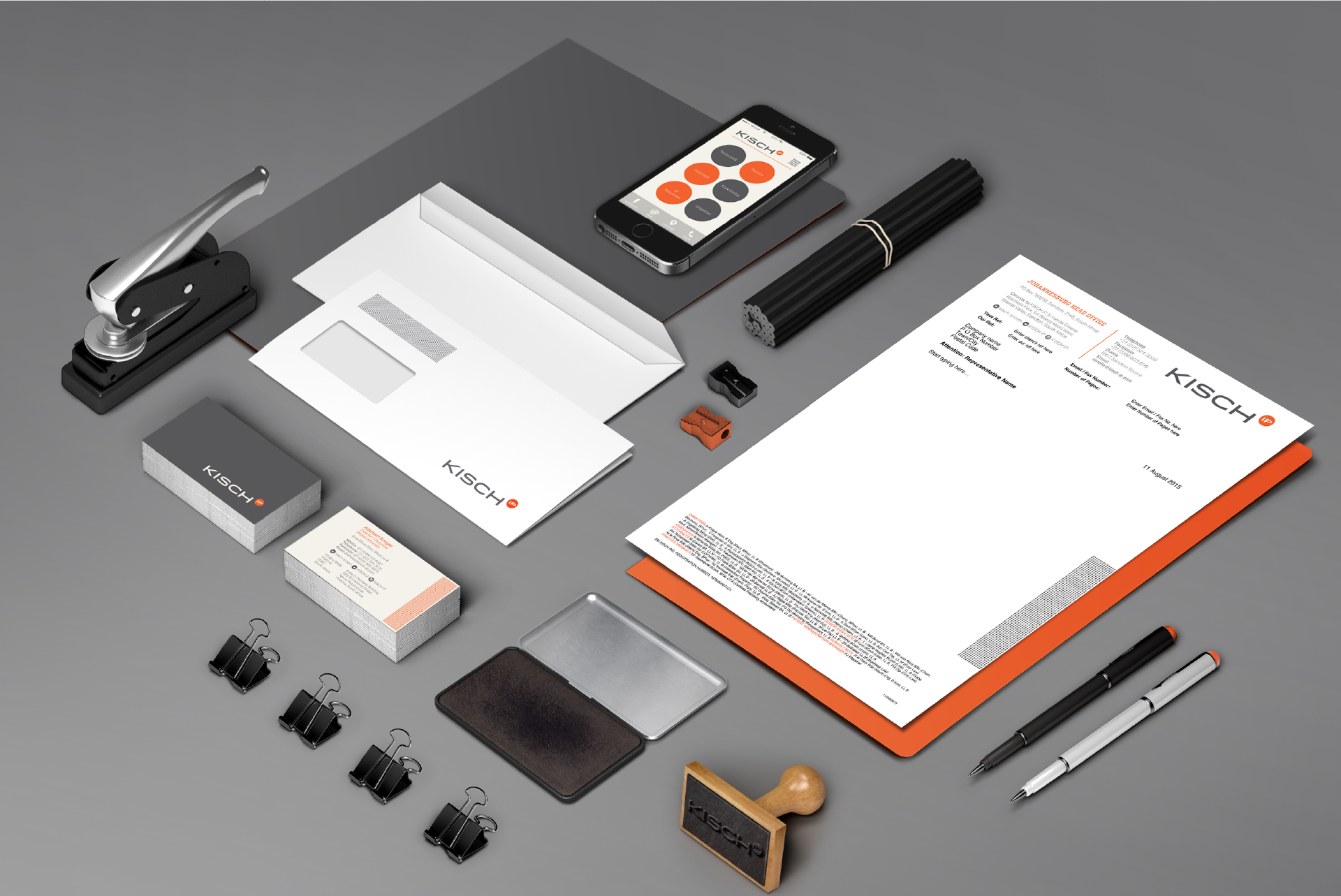
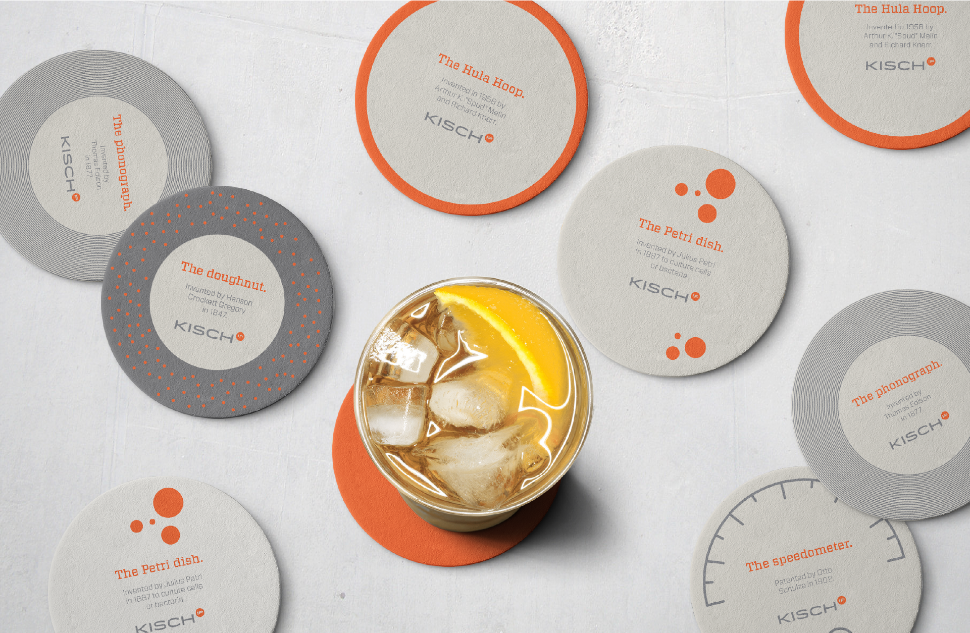
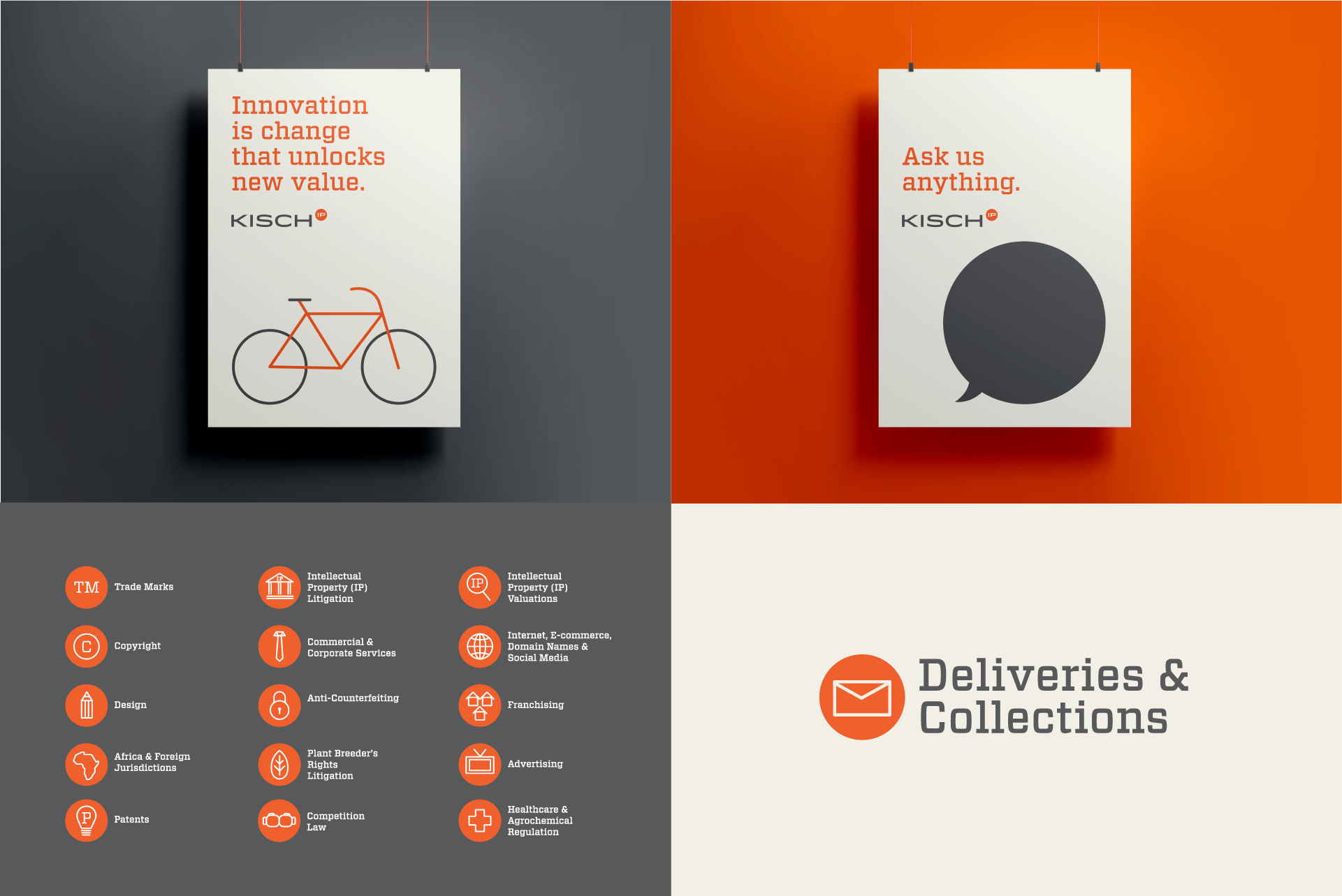
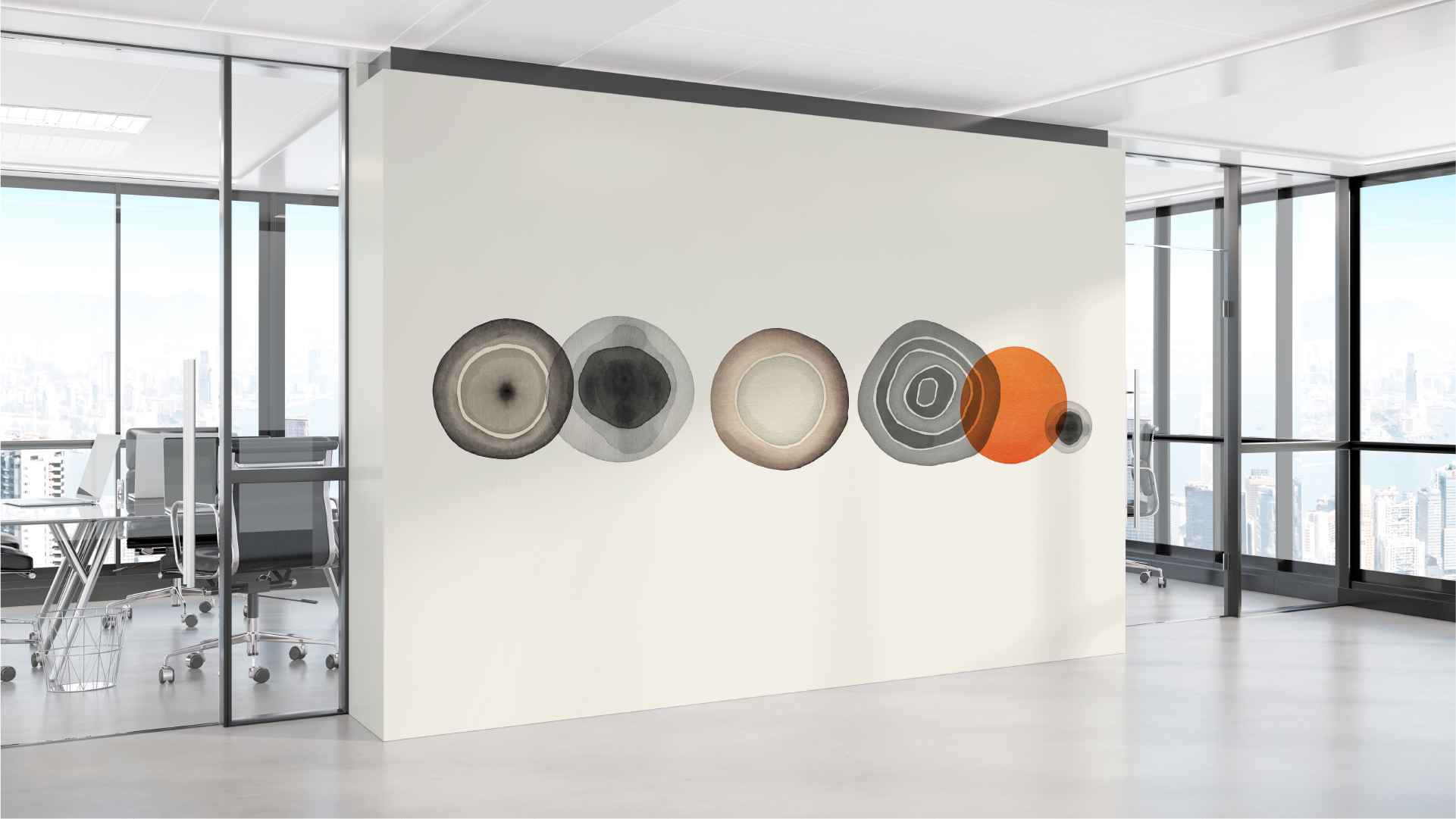
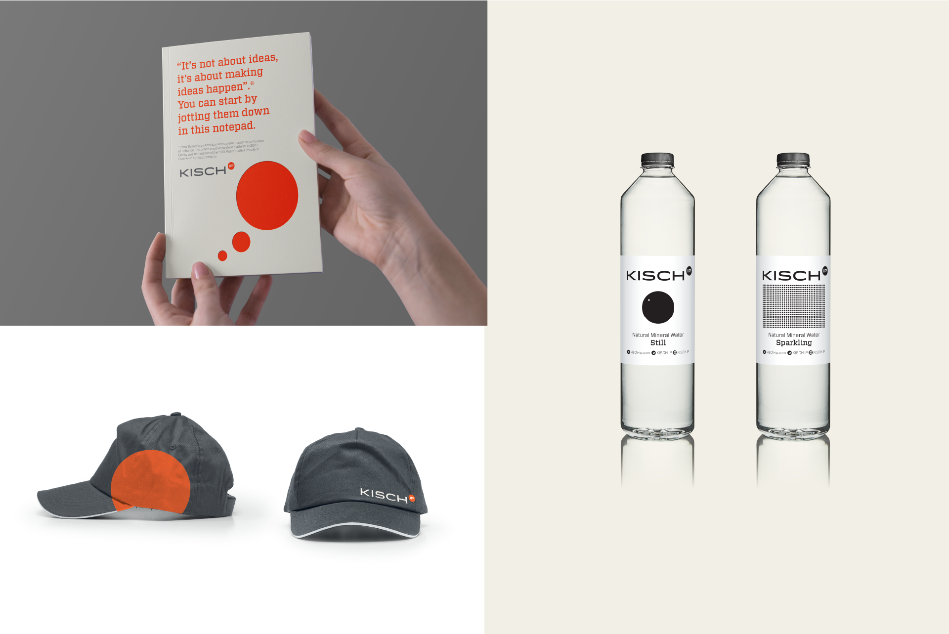
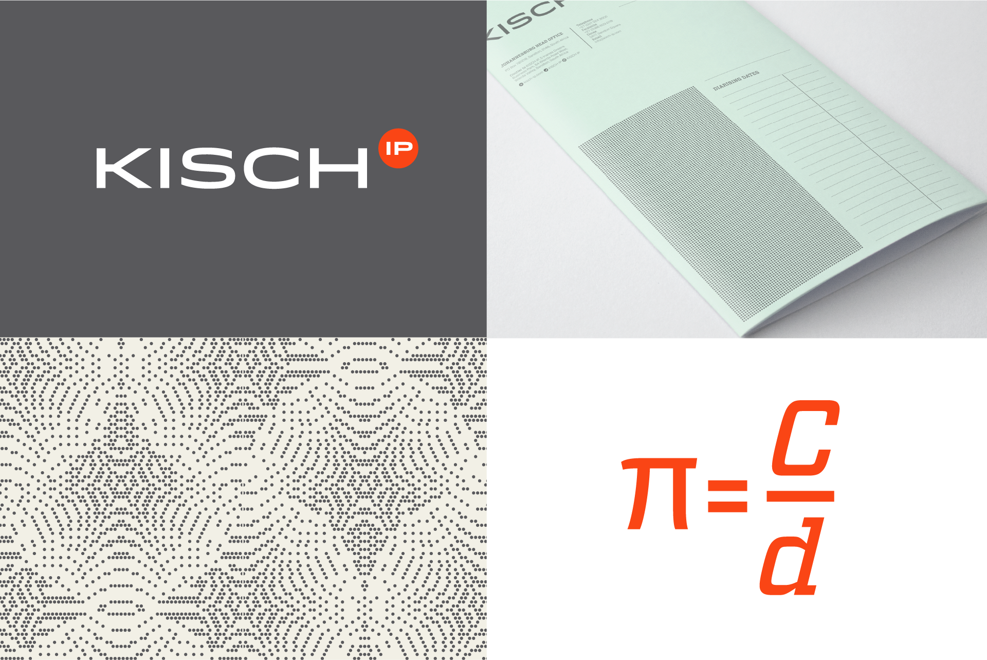
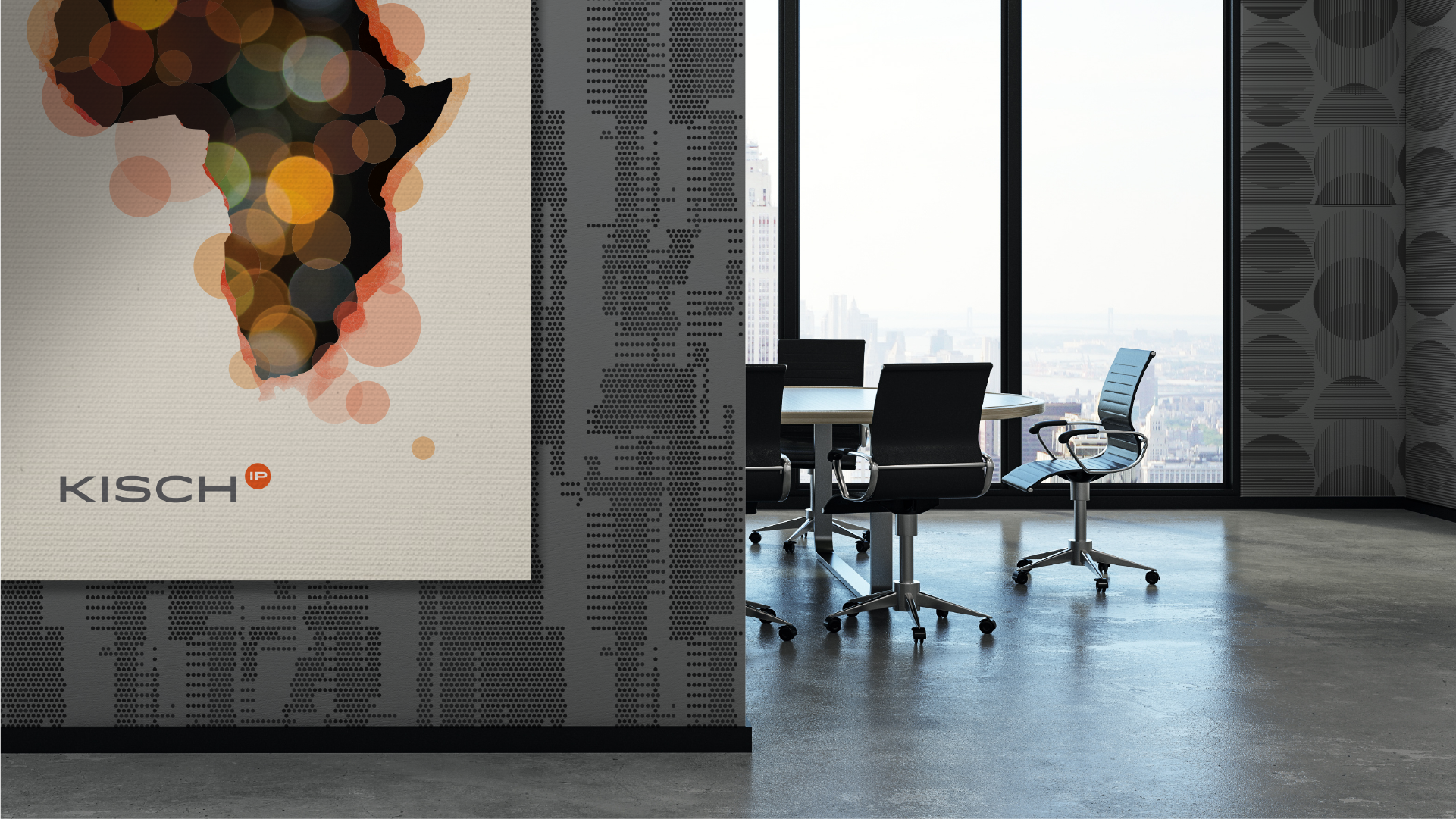
In 2015, DMK, an intellectual property law firm was rebranded as KISCH IP. "The need arose for a rejuvenated and refreshed brand that would project into the future its rich and successful history. With this, we want to reflect a healthy balance between our treasured traditions and the exciting prospects the future holds for our firm. To this end, our firm has re-branded as Kisch IP," explains Adelhart Krüger, Chairman: KISCH IP. As part of KISCH IP's rebrand exercise, Bacon & Freud was approached to overhaul their corporate identity to reflect a new and contemporary African IP law firm. A distinguished word mark (logo) was created, together with a distinctive typographic palette, a pared down colour palette of 3 colours (grey, orange and ivory) as part of the overall visual language. The visual identity that underpins it has also changed to represent much more; the new logo plays on the trade mark symbol while the choice of a circle was selected for its simple shape in Euclidean geometry.
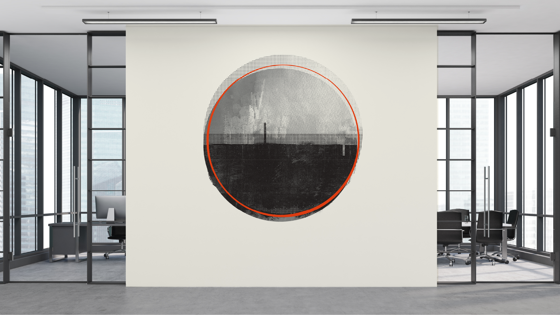
The circle is the basis for the wheel, which, with related inventions such as gears, makes much of modern machinery possible. In mathematics, the study of the circle has helped inspire the development of geometry, astronomy, and calculus all of which have gone on to inspire and facilitate inventions throughout history.
